Art Project – Kilkenny winter landscape – Photo,Drawing and Acrylic painting.

January Forst
County Kilkenny
Irish Landscape Photography
Nigel Borrington 2019
Kilkenny winters Landscape project Jan 2019
This is the complete set of images including the original photograph, then the Charcoal and Pencil drawing and Acrylic painting on canvas, from the set of county Kilkenny landscape in winter photos captured last week and that I have spent most of this week working on.
This is only the first set of images and I have a lot more work to do yet to produce final drawings and painting of both this single photo and then the full set of other images I want to use. I am happy with the results so far as this is the first none digital art work that I have worked on for a while.
The main thing at the moment is that I am enjoying the process very much, its taken a while to get my art desk setup again and to get all the materials in place but now this is done I can just get working and start having some fun getting creative.

county kilkenny landscape art
The view from Ballycuddihy
Charcoal and Graphite on paper
nigel borrington 2019
This drawing uses Charcoal and Graphite pencils on paper to produce what I hope is a moody image of a winters morning over the local Kilkenny landscape.
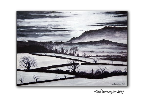
County Kilkenny in Winter
Acrylic on Canvas
Nigel Borrington 2019
This Painting was produced using greys mixed from Acrylic (Cerulean blue, Crimson, Yellow Ocha and titanuim white)to produces grades of Greys, some cool and some warmer.
I hope that this helps to set a feeling of winter in my local Kilkenny landscape, on what was a very cold and frosty morning in mid January 2019.
Berlin from the river Spree

Berlin
from the river spree nigel borrington 2019
Selecting images for an drawing and painting portfolio
Over the next few weeks any images I post on my blog will relate to a selection process I am making for producing some art work. I want to go through my blog photos posted since 2011 and select images that could related to both pencil/ink and Charcoal drawings along with images the will make good subjects for Painting in Acrylic/oil paints. I also have many images that I never posted here, as when I get my camera into the landscape I try to almost exhaust the location as much as possible by taking many images.
With this image of Berlin from the river Spree, I felt it would make a great subject for Charcoal, Pencil and Pen and ink work.
This is a process I have wanted to do for sometime, as it will help me get focused on the art work I want to produce during 2019…..
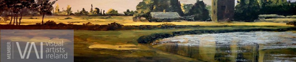
County Kilkenny Art – The view from Ballycuddihy – charcoal and graphite drawing

County Kilkenny landscape art The view from Ballycuddihy
Charcoal and Graphite on paper
nigel borrington 2019
The view from Ballycuddihy – charcoal and graphite on paper
In my last post I uploaded some photos taken in the hills at Ballycuddihy county Kilkenny, I want to use these images and others as the source for a series of both drawings and acrylic paintings.
So over the weekend I started with a charcoal and graphite drawing. I like very much using these two drawing materials as I like to strip an image down into its monochrome tonal values before returning to repeating the painting in acrylic or oil paint and bring in colour paints. I plan this time however to paint these landscape views using acrylic paint, using black and white only, keeping the finished work to a maximum of ten grey scale values.
Here I have used the charcoal in both willow stick and compressed block form to produce a series of tonal values, using a brush to soften the charcoal into different grey values and tonal grades.The fine details in the drawing are created using graphite.
I am happy with the finished results considering that the drawing was completed within four hours, I have learnt many things here and will repeat this technique many time so that I keep getting to know much more about using charcoal and pencil together.
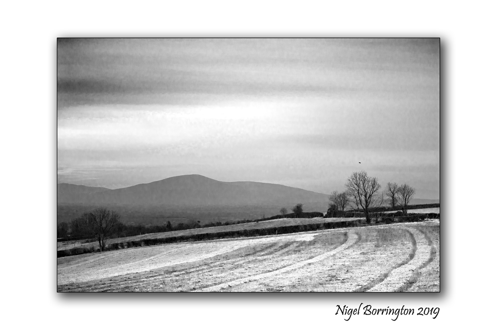
January frost – A black and white gallery

January Frost
County Kilkenny
Irish Landscape Photography
Nigel Borrington 2019
This Morning we had our first frost of the year 2019 and the view from the hillside of county kilkenny was amazing.
Here are three black and white images, I used black and white because I felt it captured the frosty landscape perfectly ….
A Frosty January Morning, Gallery

A Weekend in an Art Course – The art of colour mixing , Rod Moore

Art Courses 2019 – The art of colour mixing , Rod Moore
I have been into art and painting most of my life and you never stop needing to learn new areas or keep going back to basic and practice old ones, so at the start of this year I registered on a Udemy course run by Rod Moore (Rod Moore, Complete Colour mixing course for artists).
I started the course last week in the evenings and so far its very good, I like very much the structure of the courses run by Udemy as they are perfect for adult study allowing you to use your spare time to gain new skills.
Here are some of the basic colour mixing techniques I have covered so far…..
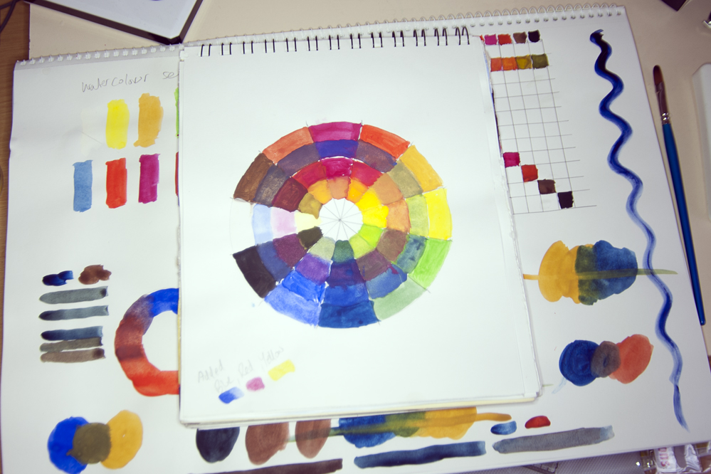
Creating a colour mixing wheel.
Here the colours provided in my watercolour palette are laid out on the very outside of the wheel, working inwards I have mixed the primary colours of Blue, Red and then Yellow to show the results of mixing primary colours.

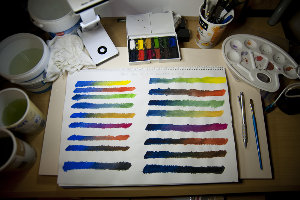
Mixing Blue, Reds, Yellow and Greens.
Most sets of paints contain more than one type of Blue, Red, Yellow and green paints, so in the above images I have worked on taking all the paints in these groups one by one and mixing them with the other paints outside the selected group. The first image for example is using two versions of green, the second two versions of blue – then mixing these with all the other remaining colours.
This type of colour mixing produces some very interesting results and helps show just how different the results of mixing different Blues, Reds, Yellows and Greens with other colours can be.
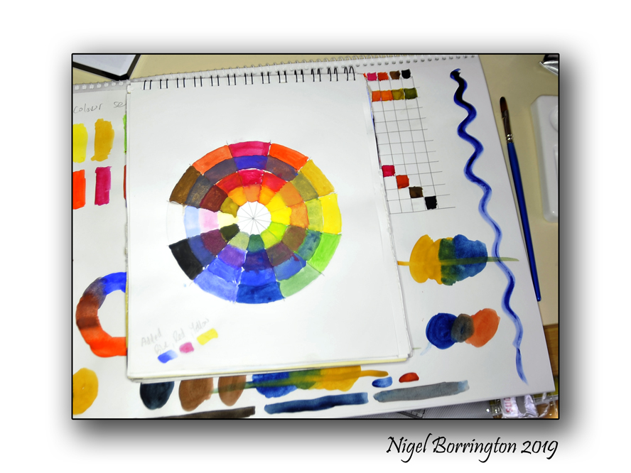
Landscape colour mixing – wheel and chart.
As said above different available paints can fall into the basic descriptions of blues or yellows and reds, but are individually very different from each other, in the images above I have painted a colour wheel that uses more earth versions of these primary colours.
These versions of the Primary colours (Blue,Red and Yellow) when mixed help to produce results much more likely to be used in Landscape Painting, you can see that they results in a much more earthy looking colour wheel than one produced by more standard primary colours.
I have also produced a colour chart on the right hand side of this page that shows the same mixing results but in block of colour, the standard mixing chart is in the centre of the page and as you can see this produces a much more vivid set of resulting colours, ones much less suitable for landscape painting.
One thing I have noticed while working through these exercises is that watercolour paint does not mix very well compared to Acrylic or Oil paints, which both produce much better stronger results. Its harder to get watercolour to produce many different levels of the mixed colour and for these results to have much depth to them , so my next stage is to repeat all these exercises using artists acrylic paints.
So all in all I feel great about working with this course and had a very enjoyable time over the weekend, I am not intending to turn my blog into just Art and Painting so for now I will return to some photography but its be great fun sharing something different 🙂
A weekend with colour …….

Colour mixing,
WaterColour and acrylics
A weekend in colour
This week I started an online course in colour mixing for watercolour and acrylic painting, so during this weekend I plan to spend as much time as possible learning colour theory.
I worked on the course in the evenings and have already used up a few pages of a new sketchbook, including the pages I have posted here.
I feel that one of the most important things I have learned so far, regardless of the type of paint used (Watercolour or Acrylic) is that I am getting to know them very well, how to mix the basic colours included in a sets of paints and what the results look like. Not all colours act the same even when used without mixing them, some colours produce very smooth results others produce a very grainy texture, some colours don’t seem to go into the paper or canvas very deeply others act more like a dye and the moment they touch a painting surface they stain and fix themselves in very quickly and most likely permanently.
The use of colours
When I first stated painting some years back, I would spend a large amount of time trying to match every single colour in a landscape I was painting, however I feel that since these days I have learnt that doing this is not only exhausting it also does not always produce a good painting. Colours can be used much more effectively when limited and balanced so that they are used to compliment each other. When colour is used to highlight areas in a painting or to soften other areas they can make some parts of a painting stand out and others while still included, fall into the background of the finished work.
It’s all these areas and more that I want to study and regain complete understanding again of both in practice and theory, I can then move onto producing colour sketches and full paintings again.

Colour mixing, using just Primary colours
In order to produces all the colours you want to include in a painting you actually only need three , The primary colours (RED,YELLOW and BLUE), what does counts here however is the type of red, yellow or blue you start with in the first place as this will allow you to produces very different final results.
So this weekend I plan to uses as much paper as possible and produce a colour notebook that I can use during the year to help me when producing any paintings I start working on.
If I get time I will post on my progress but if not, I will on Monday post some results and my thoughts on what I worked on.
Connemara, Co. Galway, Ireland – The Landscape of Poetry – Poems by Mary O’Malley
Connemara
county Galway
Ireland
Nigel Borrington
2019
Connemara, Co. Galway
Mary O’Malley is truly the person who has written Connemara, her writing laced with the fierce beauty of the landscape, and the sounds of the sea. In ‘Porpoises’ she sends our minds out to sea from the most westerly point of the county:
The sky is close.
Out from the once manned rock
White electric light
Arcs over the Water
Difficult not to agree with her when she states that the sea is “just the place from which all things make sense”.
Pierce Hutchinson, also writing on Connemara, said:
There are chinks between
the neat stones to let the wind through safe,
You can see the blue sun through them.
But coming eastward in the same county,
the walls grow higher, dark grey;
an ugly grey. And the chinks disappear:
through those walls you can see nothing.
Perhaps our poetic landscapes remind us of that – to keep our hearts alert for experiences of water, wind and wonder.

2019 – A new light , sunrise over Kilkenny’s fields …….

Starting my 2019 Blogging …..
I always like to start my blogging for a new year by changing my site heading image.
This year my first image taken and posted – my new site header image was taken on Sunday Morning at first light, I was on an early morning walk and the weather was cold with a full covering of cloud. I had just about completed the 5km walk I had planned to do and had almost given up on capturing any images as the light was just so unexciting when the sun came bursting through an opening in the clouds and located itself just about some trees in the distance.
I have taken a little time off-line over the Christmas and New-Year period just to give myself an old fashioned way to celebrate and recharge my batteries, I spend some great time with family and friends 🙂 and as a result I feel great and am looking forward with new energy to 2019 and the future 🙂 , my blog and my love of photography still play a massive part in these plans 🙂
I also noticed that the number of likes and visited to my Blog (started in 2011) went well over the 350,000 mark while I was away – I would like to say a massive THANK YOU to you all for this, I don’t post here with such figures in mind , I post to share the things I see and capture around me – That said ! Getting this level of interest and support with so many likes has been a massive boost to me and a huge reason to drive me on in keeping sharing my images and a love of both Art and Photography!
THANK YOU SO MUCH !!!!

350,000+ WordPress Blog likes and Visits – THANK YOU SO MUCH !!!
I added this thank you message to the post blow but feel that I should also post it by itself !
” I just noticed that the number of likes and visited to my Blog (started in 2011) went well over the 350,000 mark while I was away – I would like to say a massive THANK YOU to you all for this, I don’t post here with such figures in mind , I post to share the things a see and capture around me – That said ! Getting this level of interest and support with so many likes has been a massive boost to me and a huge reason to drive me on in 2019 to keeping sharing my images and a love I have of both Art and Photography!
THANK YOU SO MUCH !!!! “
Share this:
January 8, 2019 | Categories: Comment, Nature and Wildlife, Solo images | Tags: Thank you | 1 Comment