An industrial landscape : Acrylic ink on Board
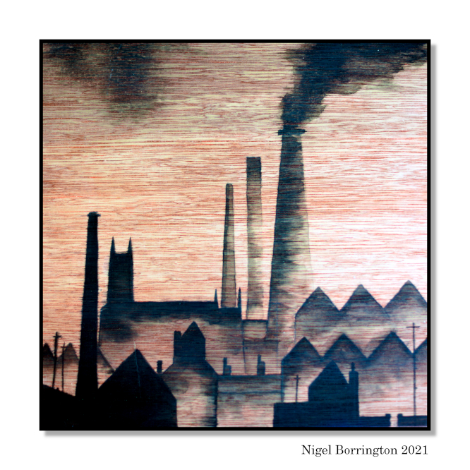
My childhood was spend in Altrincham, greater Manchester, towards the end of hundreds of years of history lived within the Industrial age. I can just about remember the look of the towns industry parks like broadheath near the bridgewater canal, that passed through our town on its way into the city of Manchester.
I have been working on a personal art project for about the last twelve months, working mainly with charcoal on paper, I felt that charcoal was the perfect medium to work with as I can remember just how black these places looked as a result of the smoke created from the burning of coal used to create the energy needed to drive the factory machine.
This week I have moved onto creating a series of images painted onto timber boards, using black Acrylic ink. The boards I am using have a great pink and red feel to them and they also have a fantastic horizontal grain that adds a very likeable texture to the finished work! At first I was considering painting the board with a white under painted ground, In the end I made a great choice (I feel) in just painting directly onto the timber.
I intend now to work on a good collection of these boards, working with many different compositions, talking of which I feel this subject is all about composition and I am learning a lot in this area by doing this work, treating the factory buildings as shapes to be visually moved around in my mind, overlapping them and working them into a valuable depth from background to foreground, never letting any object rest and stand by itself until the ones that are the closest to the viewer…..
A weekends drawing – Still life Study – Three Pears
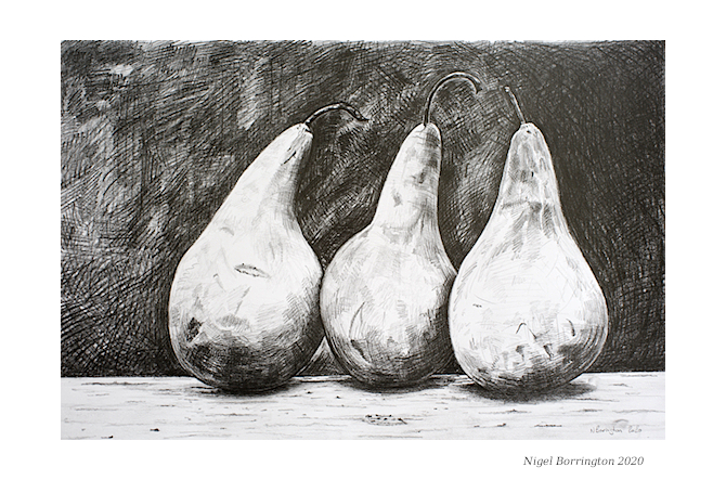
Still life – Three Pears
Graphite pencils
A2 cartridge paper
Tate Gallery online .
While art galleries like the Tate are closed at the Moment, they still have a great collection of art work online along with how to videos.
So if you want to have a go at learning some ART go check out some TATE How to videos 🙂
Artist from My Home town (Trevor Grimshaw)

Trevor Grimshaw
Open Space
1974
I guess we always, no matter how long we have lived away from our place of birth feel that Home is Home!…
I have lived here in Ireland for almost two decades now but when it come to artists I still have two at the top of my list who lived and worked as artists in or around the greater Manchester area in the UK.
At the top of my list will always be Ls Lowry 🙂 I have a post on his work here Ls Lowry and here, If you want to know more about his life and work, Manchester has a great gallery (The lowry Gallery) dedicated to his life and his art work, its a fantastic Gallery and a great source for his history.
While I love the art work of LS Lowry the art work by my other favourite Manchester artist Travor Grimshaw has always been very much in my mind when I think of amazing drawings from the industrial past of the city Manchester, along with many other surrounding towns which at the time contained industrial landscapes such as Bolton.
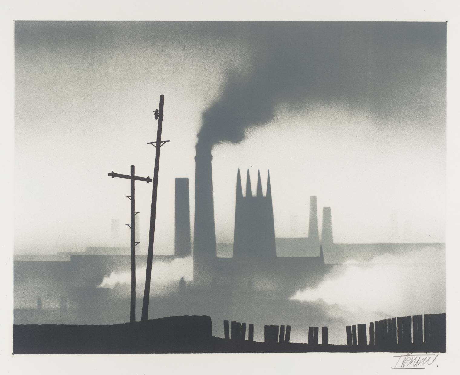
Northern Townscape 1974 Trevor Grimshaw 1947-2001 Presented by Christie’s Contemporary Art through the Institute of Contemporary Prints 1975
What I like most about Grimshaw’s work is his ability to limit this images down to a single style and his limited use of materials – along with his his use of moody monochromes. I work a increasingly with drawings these days and love the feeling produced when just using medium’s such as charcoal or pastels along with graphite.
Here its like he knew perfectly well that these limited materials were perfect for representing the smoke and coal dust filled factory landscapes of the English north west and he stayed with these materials for the vast majority of this well know works.
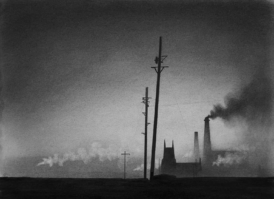
Trevor Grimshaw (1947-2001) – Two Telegraph Poles – 1972
Take this image (Two Telegraph Poles) for example, like a lot of his drawings and painting there is little subject matter in them, if you compare these images to the paintings of LS. lowry, these landscape are empty. There are none of the hundreds of people all going about their activities.
All the art work is done here by empty views that contain some of the most moody drawings I think I have ever seen ….
Here is a full description of Trevor’s life and his working career ….
Life and work
Grimshaw was born in Hyde, Cheshire in 1947 and studied at the Stockport College of Art from 1963 to 1968. He developed a unique style working in oils, charcoal and graphite to produce atmospheric, stylised images of the Northern industrial landscape, mainly in monochrome.
As a child he had a passion for steam engines and trainspotting, which continued into adulthood; for example he made the journey to the scrapyard at Barry in South Wales which held hundreds of steam locomotives awaiting scrapping, and made a personal photographic record of the occasion, 34 photo images being used in his publication “Stilled Life”. Much of his work overall features steam engines.
He spent much of his working career at Manchester advertising agency Stowe Bowden Ltd.[citation needed]
Artistic career
Grimshaw exhibited widely in the UK (including at the Royal Scottish Academy and the Royal Academy in the 1970s) and in the US and Germany. His work was included in the private collections of L.S. Lowry, Edward Heath (two drawings purchased in 1973), the Warburton (Bread) Family and Gerald Kaufman MP., and he is represented in a number of public collections, including The Tate Gallery, Salford Art Gallery, Stockport Art Gallery and Bury Art Gallery.
He illustrated The Singing Street, a book of poems by Mike Harding, and executed limited edition lithographs for Christie’s Contemporary Art. He also did the title slide images for the early BBC Great Railway Journeys of the World series. Artist Geoffrey Key described Grimshaw, a long time friend, as “one of the most important graphic artists working in the north during the last half of the 20th century”.[This quote needs a citation]
While Grimshaw is most celebrated for his black and grey graphite portrayal of post-industrial Britain (e.g. canals, cityscapes, viaducts, steam trains) his portfolio included diverse other subjects such as megaliths, Stonehenge, quarries in North Wales, motorway construction and the solstices (often in combination). Colour treatment was largely reserved for Cheshire landscapes, and pictures of Clarice Cliff ceramics.
L.S.Lowry attended one of his earliest exhibitions, buying three of his major early works to hang alongside his small collection of Pre-Raphaelites. Grimshaw became a regular visitor to Lowry’s home in Mottram.[citation needed]

In 1973 the North West Arts Association published Townscape: Trevor Grimshaw, a book reproducing 30 drawings. In 2004 a major retrospective exhibition was held at Stockport Art Gallery.
By the time of his death, in a house fire in November 2001, Grimshaw had become an alcoholic and a reclusive figure. He held his last show in 1997 in the County Museum and Art Gallery at Prostejov, Moravia, Czech Republic, his 50th show in his 50th year.[citation needed]
Grimshaw’s daughter organised a retrospective exhibition of her father’s work, which took place from February to May 2004 at Stockport Art Gallery.
In June 2014 an exhibition of his paintings, organised by family friend (and owner of the collection).
Ceridwen Grimshaw (Trevor’s youngest daughter) recently discovered negatives taken from Grimshaw’s 1970’s 3 trips to Barry Scrapyard (see above). Almost 100 of these images were unused and 90 will be exhibited at Stockport War Museum and Art Gallery from 11 May 2019 to June 15, titled “Trevor Grimshaw – Unseen Barry Photographs”. Grimshaw’s intention was to show the effects of Barry’s salt air on over 100 steam locomotives awaiting scrapping (although most were eventually saved).
Kilkenny landscape art – Charcoal and Pastels on Paper – Winter trees

Kilkenny landscape art,
Winter Trees,
Charcoal and Pastels on Paper
Kilkenny landscape art – Charcoal and Pastels on Paper – Winter trees
This is my second large scale drawing this week, worked on an A2 sheet of cartridge paper with the drawing itself being formatted to fit inside an A3 mounting card and frame.
I am really enjoying working with charcoal and pastels again, I feel that I could and most likely would be able to get more detail into each drawing if I used a set of pencils, high details for each landscape view however is not that much of a worry for me at the moment. The drawings I am working on at the moment are aimed at being Proprietary Artwork for later paintings.
I am learning all the time now about the possibilities of working with what is the very basic mediums of black charcoal and Pastel, the skills of blending and smoothing the charcoal on the paper, back into areas of grey. Drawing with both these mediums is very interesting, detail is possible but needs care to produce, each stage of the drawing needs fixing on the paper so that it is not smudged.
As with any drawing or painting when finished there are areas I like and areas I do not, here I loved working of the misty sky and the trees but found the foreground of the wet muddy field a challenge. I am happy overall and feel I have managed to work in lots of texture and levels of details hidden in the mud in the foreground and very happy with the blended sky.
I am not in all honesty yet looking for finished work as I want to keep learning as much as possible so the more I learn the better and the more that makes me have to look and think about a finished work the better. I am not finishing anything that I would not show to anyone so that is at least very pleasing.

This is the same drawing cropped down, I wonder if its better without the foreground area or better with it ?
If anyone wants to make a comment here – it would only help me 🙂 🙂
A Weekend in an Art Course – The art of colour mixing , Rod Moore

Art Courses 2019 – The art of colour mixing , Rod Moore
I have been into art and painting most of my life and you never stop needing to learn new areas or keep going back to basic and practice old ones, so at the start of this year I registered on a Udemy course run by Rod Moore (Rod Moore, Complete Colour mixing course for artists).
I started the course last week in the evenings and so far its very good, I like very much the structure of the courses run by Udemy as they are perfect for adult study allowing you to use your spare time to gain new skills.
Here are some of the basic colour mixing techniques I have covered so far…..
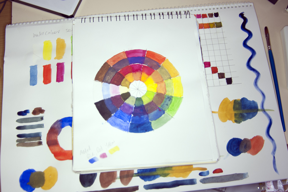
Creating a colour mixing wheel.
Here the colours provided in my watercolour palette are laid out on the very outside of the wheel, working inwards I have mixed the primary colours of Blue, Red and then Yellow to show the results of mixing primary colours.

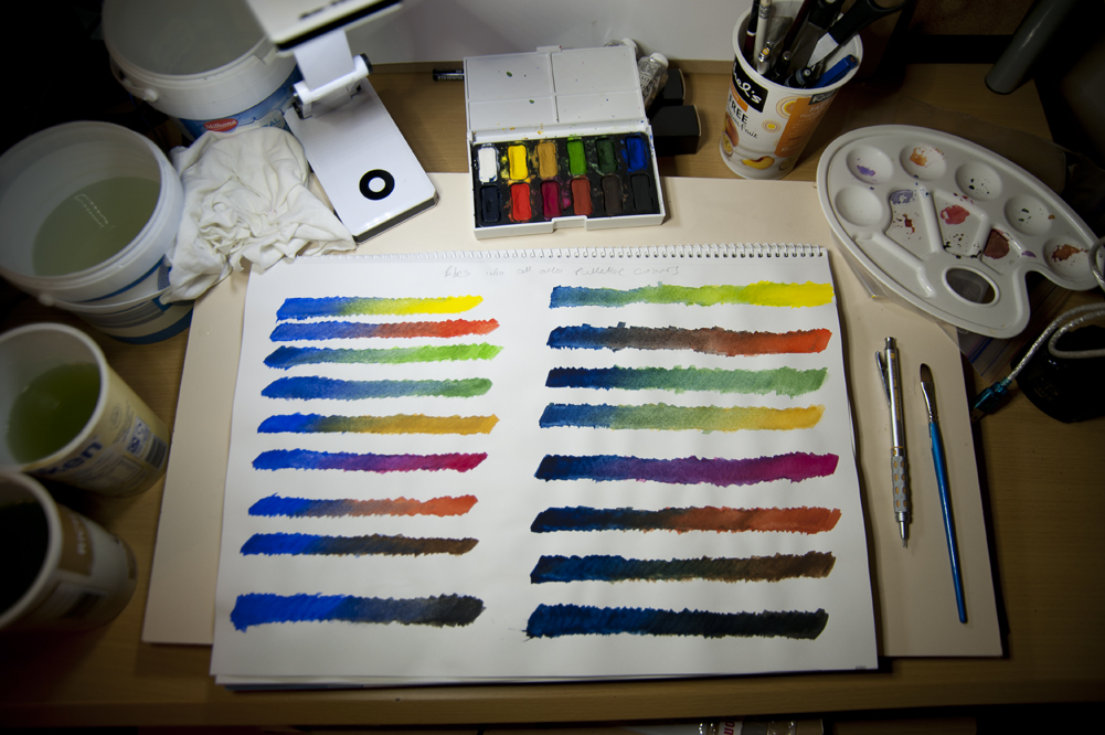
Mixing Blue, Reds, Yellow and Greens.
Most sets of paints contain more than one type of Blue, Red, Yellow and green paints, so in the above images I have worked on taking all the paints in these groups one by one and mixing them with the other paints outside the selected group. The first image for example is using two versions of green, the second two versions of blue – then mixing these with all the other remaining colours.
This type of colour mixing produces some very interesting results and helps show just how different the results of mixing different Blues, Reds, Yellows and Greens with other colours can be.
Landscape colour mixing – wheel and chart.
As said above different available paints can fall into the basic descriptions of blues or yellows and reds, but are individually very different from each other, in the images above I have painted a colour wheel that uses more earth versions of these primary colours.
These versions of the Primary colours (Blue,Red and Yellow) when mixed help to produce results much more likely to be used in Landscape Painting, you can see that they results in a much more earthy looking colour wheel than one produced by more standard primary colours.
I have also produced a colour chart on the right hand side of this page that shows the same mixing results but in block of colour, the standard mixing chart is in the centre of the page and as you can see this produces a much more vivid set of resulting colours, ones much less suitable for landscape painting.
One thing I have noticed while working through these exercises is that watercolour paint does not mix very well compared to Acrylic or Oil paints, which both produce much better stronger results. Its harder to get watercolour to produce many different levels of the mixed colour and for these results to have much depth to them , so my next stage is to repeat all these exercises using artists acrylic paints.
So all in all I feel great about working with this course and had a very enjoyable time over the weekend, I am not intending to turn my blog into just Art and Painting so for now I will return to some photography but its be great fun sharing something different 🙂

You must be logged in to post a comment.