


High on a hill an Acrylic, February 2020 – Poem : In hallowed hills by : CA Guilfoyle Jun 2015

High on the hill
Acrylic on canvas
Feb:2020
Nigel Borrington
In hallowed hills
CA Guilfoyle, Jun 2015
When we were far
and very young, in a place with no roads to follow
only a winding path, a branch to grasp
a place to fill the hollow
Blue the summer, with drowsy daisies came
petals, petals, we drew circles round the sun
gold spun, our halo heads of pollen
gold the bees of sleepy flowers
amid clover grass heaven
Days we lived deep in hills
we were endless green, in unmapped countries
stretching past the farms afield, in other worlds
too far to see, we lived beyond the gray of days
and we were free, in the shining silver
of our hallowed hills of ever.
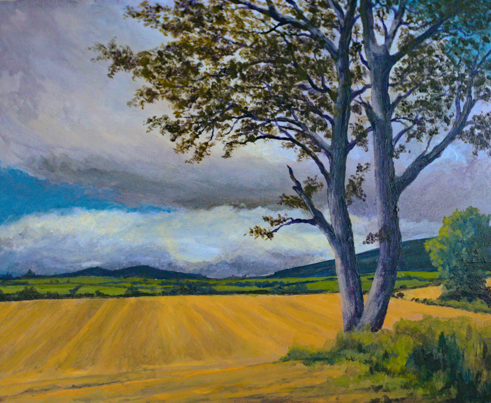
New art work 2020 – February light on Tipperary Fields

Acrylic on Canvas board
Nigel Borrington
Feb : 2020
Over the last few months and for the first time in a good few years, I have been attending some art Classes at our local art school KCAT, so I wanted to share some of the work they have helped me start to produce again, here on my blog!
The course has covered the subjects of drawing and of painting, I need to get my drawings and paintings so far captured so I can post them here, something I will do this week but for now here is an acrylic landscape painting, a view of a late February afternoon about 10 miles from home. I love these late winter days when its sunny, the Sun light on our green Irish landscapes is just amazing 🙂
Berlin from the river Spree

Berlin
from the river spree nigel borrington 2019
Selecting images for an drawing and painting portfolio
Over the next few weeks any images I post on my blog will relate to a selection process I am making for producing some art work. I want to go through my blog photos posted since 2011 and select images that could related to both pencil/ink and Charcoal drawings along with images the will make good subjects for Painting in Acrylic/oil paints. I also have many images that I never posted here, as when I get my camera into the landscape I try to almost exhaust the location as much as possible by taking many images.
With this image of Berlin from the river Spree, I felt it would make a great subject for Charcoal, Pencil and Pen and ink work.
This is a process I have wanted to do for sometime, as it will help me get focused on the art work I want to produce during 2019…..
A weekend with colour …….

Colour mixing,
WaterColour and acrylics
A weekend in colour
This week I started an online course in colour mixing for watercolour and acrylic painting, so during this weekend I plan to spend as much time as possible learning colour theory.
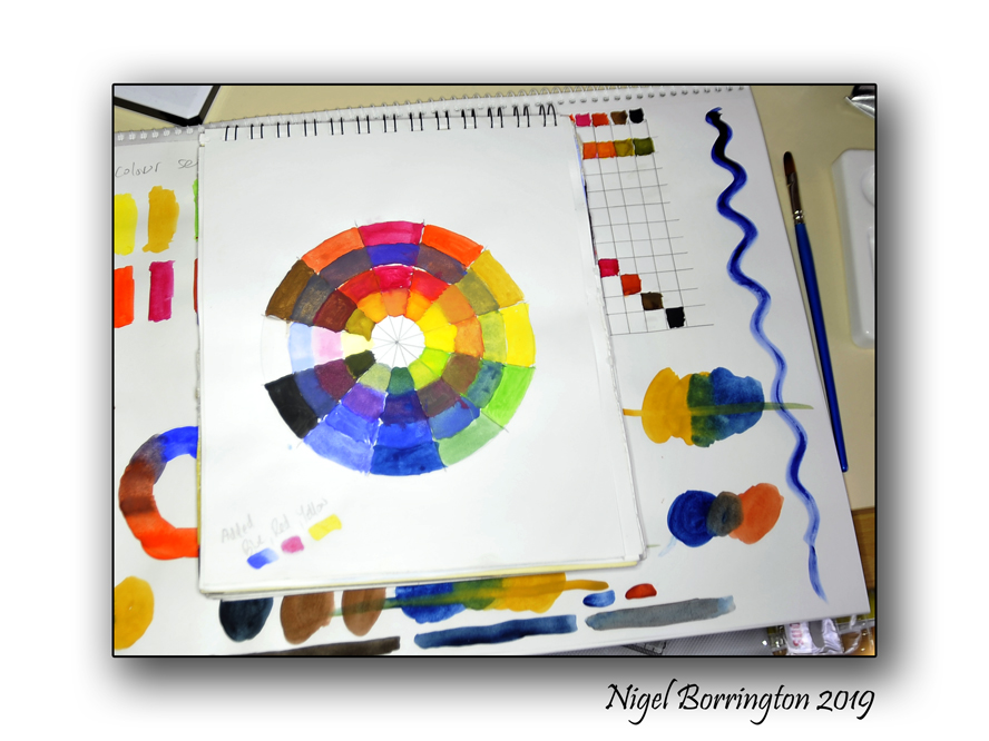
I worked on the course in the evenings and have already used up a few pages of a new sketchbook, including the pages I have posted here.
I feel that one of the most important things I have learned so far, regardless of the type of paint used (Watercolour or Acrylic) is that I am getting to know them very well, how to mix the basic colours included in a sets of paints and what the results look like. Not all colours act the same even when used without mixing them, some colours produce very smooth results others produce a very grainy texture, some colours don’t seem to go into the paper or canvas very deeply others act more like a dye and the moment they touch a painting surface they stain and fix themselves in very quickly and most likely permanently.
The use of colours
When I first stated painting some years back, I would spend a large amount of time trying to match every single colour in a landscape I was painting, however I feel that since these days I have learnt that doing this is not only exhausting it also does not always produce a good painting. Colours can be used much more effectively when limited and balanced so that they are used to compliment each other. When colour is used to highlight areas in a painting or to soften other areas they can make some parts of a painting stand out and others while still included, fall into the background of the finished work.
It’s all these areas and more that I want to study and regain complete understanding again of both in practice and theory, I can then move onto producing colour sketches and full paintings again.

Colour mixing, using just Primary colours
In order to produces all the colours you want to include in a painting you actually only need three , The primary colours (RED,YELLOW and BLUE), what does counts here however is the type of red, yellow or blue you start with in the first place as this will allow you to produces very different final results.
So this weekend I plan to uses as much paper as possible and produce a colour notebook that I can use during the year to help me when producing any paintings I start working on.
If I get time I will post on my progress but if not, I will on Monday post some results and my thoughts on what I worked on.
Snow at coolagh old church, county Kilkenny art work, Acrylic on canvas ….

Snow at Coolagh old church
County Kilkenny
Acrylic on Canvas
Nigel Borrington

You must be logged in to post a comment.